Ganiyan
Ganiyan
Elevating a Green Startup Brand
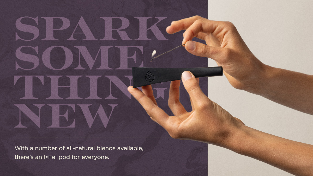
Newcomers to the cannabis scene, Ganiyan looked to 20|20 Creative Group to develop a company brand identity, as well as one for I•Fel, a quirky pod-based device designed to make the traditional flower ritual approachable to new and casual cannabis users. I took point as the lead designer of the logo and visual identity, working closely with creative director Alec Ramsey.
What I Did
Brand Strategy
Logo
Brand Identity Design
Packaging
Art Direction

Brand Identity Design
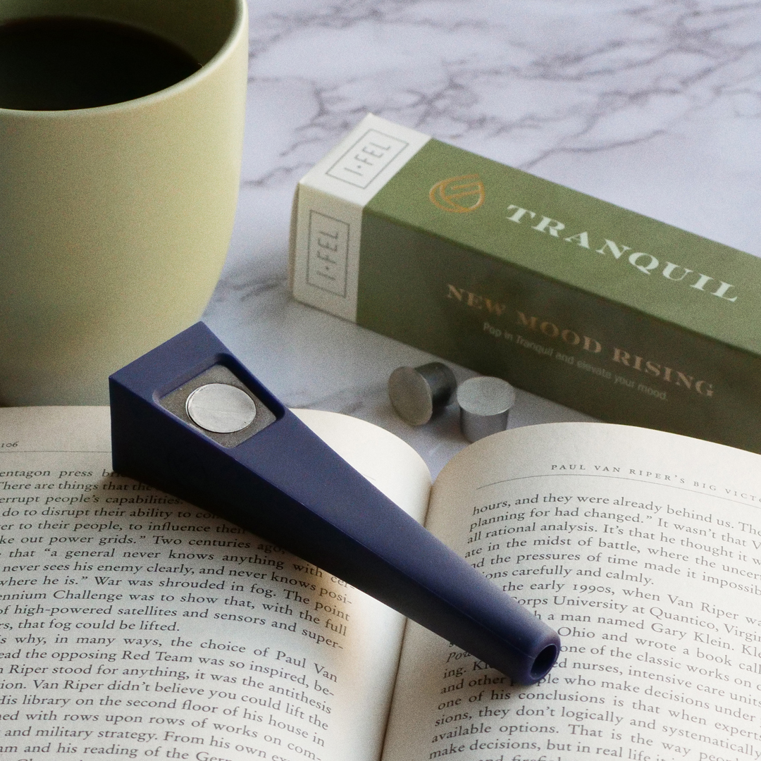
Identifying the target audience as "affluent-casual" and new the cannabis world, we took cues from brands like Nespresso to create something sophisticated, yet approachable. While a more casual written voice kept things grounded, the contemporary type palette, muted, smoky marble textures, and gold foil lent exactly the high-end feel that we envisioned.
Keeping things classy and minimal, the Ganiyan logo is an abstract combination of a cannabis bud and flame, formed into a subtle 'G' monogram.


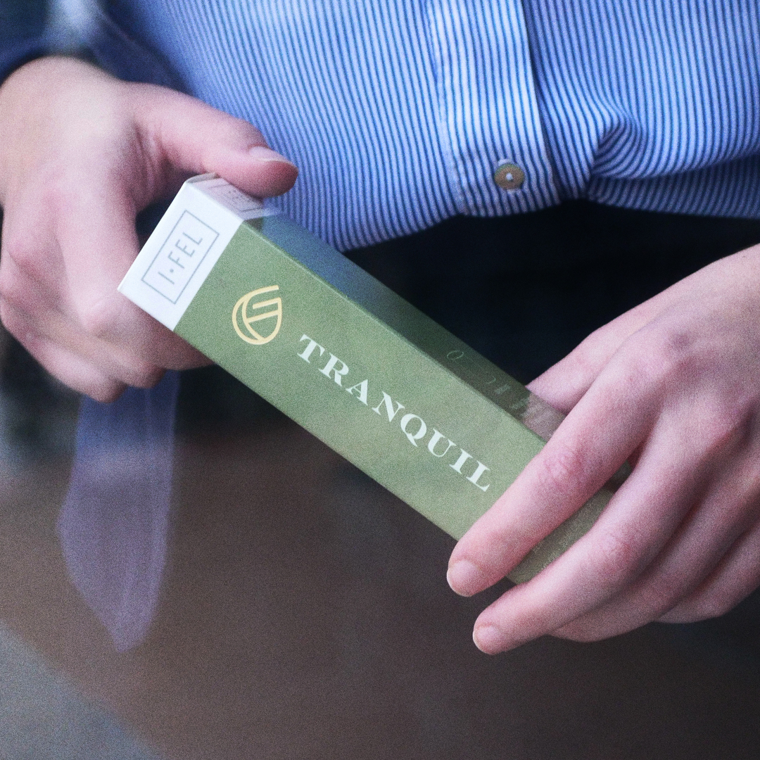
Product Identity System
Packaging demanded a tight system that could be applied across a wide range of products, with multiple pipe colorways and pod variants.
I collaborated with the team on the naming style and convention for various flower blends, curated for different contexts (creativity, relaxation, etc.) From there, I designed the packaging template, with fellow designer Meg Stinnett heading up production.

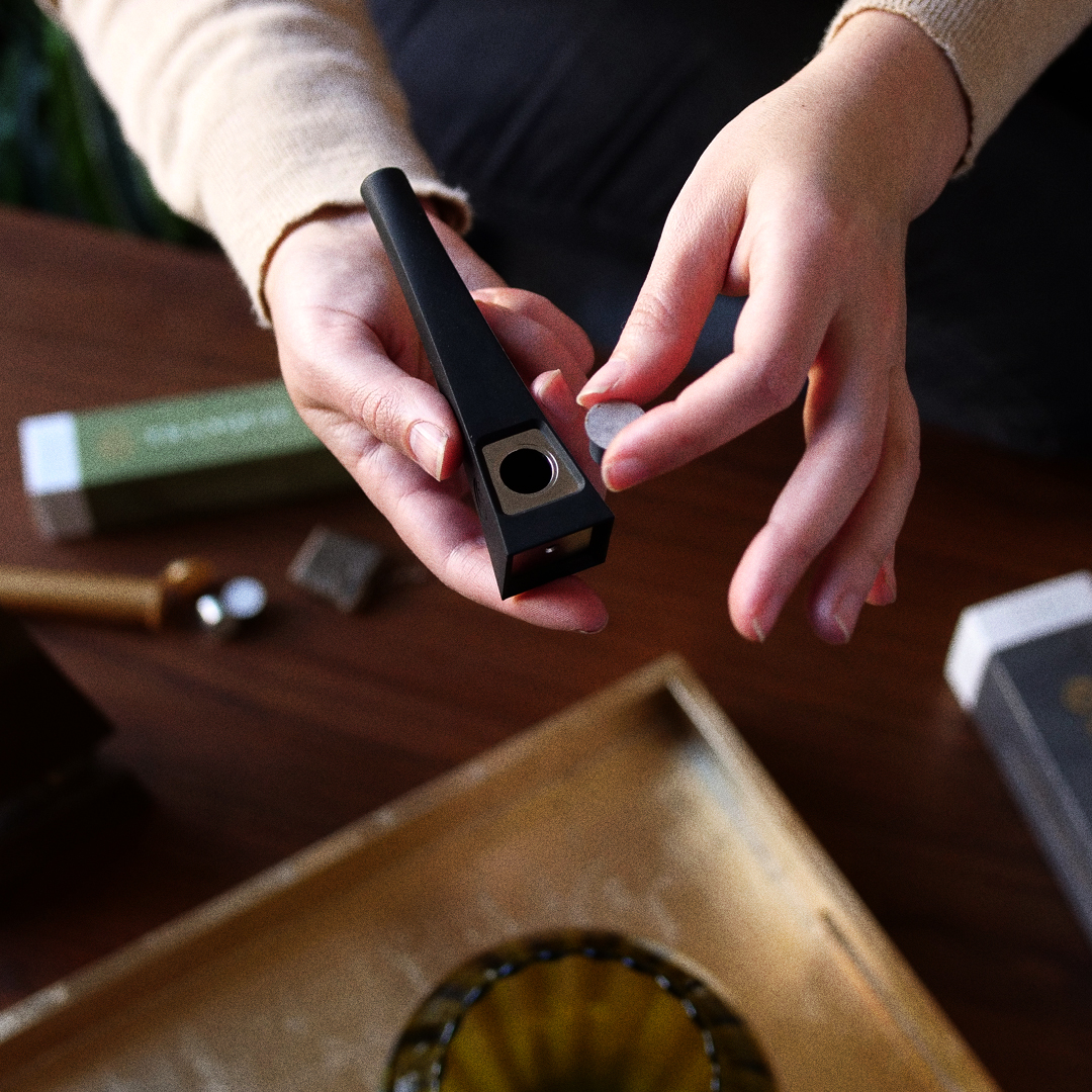
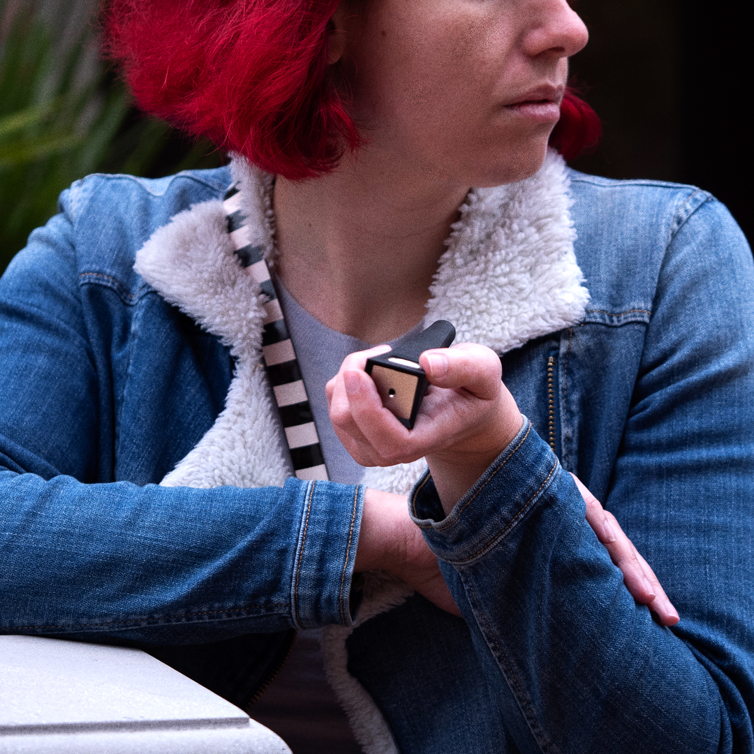
Art Direction (Photography)
Working with photographer Kent Eimers, I outlined the style for a collection of lifestyle photography assets that would be used for web and socials.
Given the novelty of the product, it was important to show it in use while also actively curating the lifestyle context. We accomplished this by way of wardrobe and set dressing—sophisticated and intentional, yet relatable and lived-in.